

Advertising Campaigns
Throughout my career, I’ve worked on numerous advertising campaigns designed for mass media, taking on roles from design to art direction to solve commercial challenges and drive sales through high-impact visuals.
With a focus on capturing consumer attention, I’ve developed campaigns that blend strategic design with striking imagery, always working closely with creative directors, copywriters, and production teams to ensure the best possible outcome.
From concept development to execution, I’ve also collaborated with photographers and directed photoshoots, ensuring that every visual element aligns with the campaign’s objectives and resonates with the audience.
ROLE
Art direction
Brand identity
Visual design
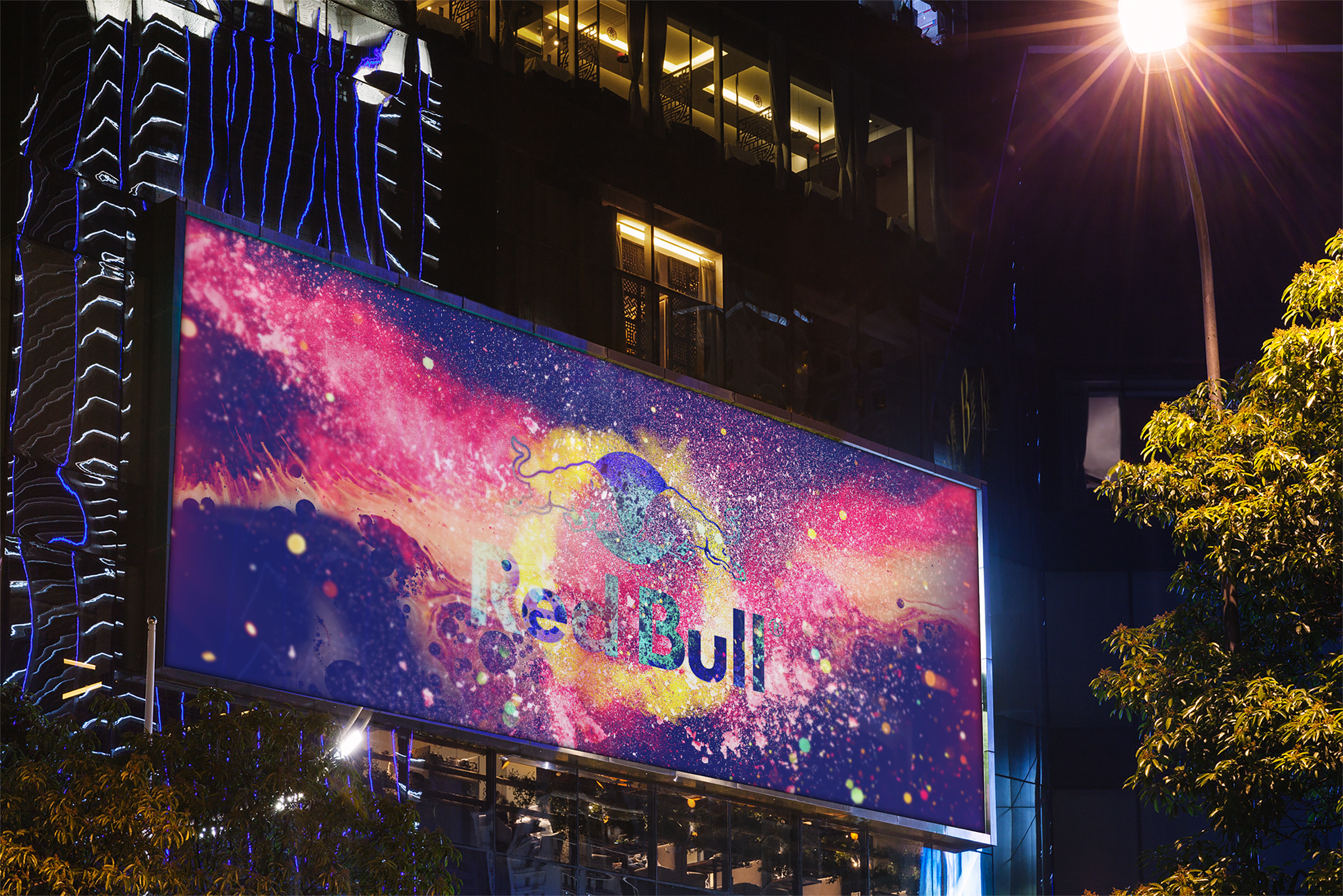
I had the opportunity to work on a Red Bull campaign that visually embodied the brand’s core pillars: creativity, energy, and movement. The challenge was to translate these concepts into static visuals that still conveyed a sense of dynamism and motion, capturing the unstoppable spirit of Red Bull.
Red Bull
Through bold compositions, high-impact imagery, and a design approach that emphasized speed, flow, and intensity, the campaign brought the brand’s energy to life. Every visual element was crafted to not just be seen, but felt, reinforcing Red Bull’s connection to those who live and create without limits.

I had the opportunity to work on a Pringles campaign that reflected the brand’s core pillars: fun, creativity, and originality. The challenge was to translate these concepts into visually striking images that captured the energy and unique character of Pringles, conveying its essence through a fresh and vibrant approach.
Pringles
Through bold compositions, vibrant colors, and a design that emphasized fun and surprise, the campaign brought the brand’s personality to life. Every visual element was created not just to be seen, but to create an emotional connection, reinforcing Pringles’ link with those who enjoy a snack with a special twist.

I had the opportunity to work on a Domino's campaign that encapsulated the brand's core values: delivering the most delicious food, operational excellence, and innovation. The challenge was to translate these principles into engaging visuals that resonated with Domino's commitment to quality and customer satisfaction.
Domino’s
By utilizing dynamic compositions, appetizing imagery, and a design approach that highlighted efficiency and innovation, the campaign effectively communicated the brand's dedication to excellence. Each visual element was meticulously crafted to not only attract attention but also to reinforce Domino's promise of delivering hot, fresh, and delicious pizza to its customers.

I had the opportunity to work on a Kalea campaign that reflected the brand’s philosophy: modern furniture that is both decorative and functional.
The challenge was to visually capture this balance, creating a campaign that felt contemporary yet timeless, stylish yet practical.
Kalea
Through clean compositions, elegant design, and vibrant accents, the visuals conveyed the idea that Kalea’s pieces are not just furniture—they are living elements that enhance any space. The result was a campaign that seamlessly blended sophistication and warmth, reinforcing Kalea’s vision of designing spaces that are both beautiful and functional.

I had the opportunity to work on a Principal Forte campaign, a liver protector designed to help you enjoy the party without the aftermath. The challenge was to visually communicate its effectiveness in combating the effects of drinking, reinforcing the idea that you can celebrate with confidence while keeping your liver protected.
Principal Forte
The key visual featured a boxing glove smashing through the word "parranda" (slang for party), symbolizing how Principal Forte helps you take on the night without worry. With a bold, energetic, and dynamic design, the campaign delivered a clear message: party hard, stay protected.

Australian (Milk)
I had the opportunity to work on a campaign for Australian, a dairy brand committed to delivering the best taste, quality, and purity.
The goal was to visually emphasize that their products are made with real, pure milk, reinforcing trust and authenticity in every message.
To achieve this, the logo was integrated into the background, blending seamlessly with the iconic black-and-white cowhide pattern, making it feel like a natural part of the design.
This approach aimed to strengthen brand recognition—allowing people to identify Australian without even needing to see the brand name.
The result was a clean, impactful, and memorable campaign that highlighted what makes Australian dairy truly exceptional.
The messages were: "Drink milk that’s actually milk", "This milk is actually milk" and "Pure, real milk".
